 TechWebWeavers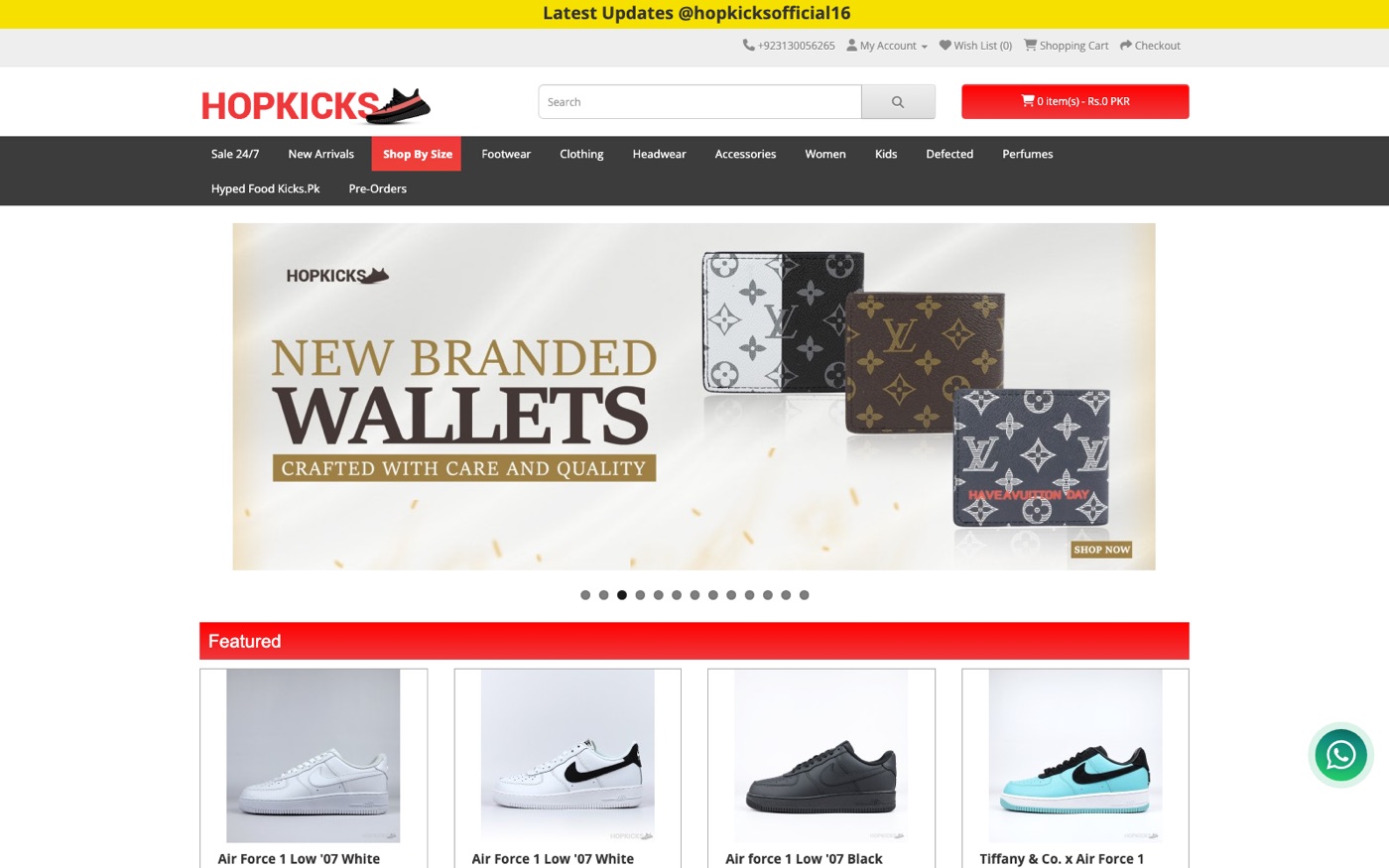
HopKicks set out to become Pakistan's go-to destination for sneakers and streetwear — which meant the storefront had to handle an enormous, fast-moving catalog without ever feeling cluttered or untrustworthy.
What we built
The navigation carries the weight of a category list most stores would struggle to organize: Footwear, Clothing, Headwear, Accessories, Women's, Kids', Defected (clearance), Perfumes, and a rotating Pre-Orders section — all reachable in one click from the homepage. A featured-products rail up top keeps seasonal drops and hero items front and center, backed by a full grid underneath.
Because sneaker buyers care deeply about authenticity and condition, we built product listings around a clear Economy / Premium / Premium Plus grading system, so shoppers always know exactly what tier they're buying before they check out. A WhatsApp support widget sits on every page for the direct, real-time questions this category of buyer expects.
Key features
- Deep category navigation spanning footwear, apparel, headwear, accessories, and more
- Three-tier product grading (Economy / Premium / Premium Plus) for transparent quality expectations
- Dedicated Women's and Kids' sections alongside the core sneaker catalog
- Pre-Order and Sale/Defected sections for time-sensitive and clearance inventory
- Integrated WhatsApp support for real-time buyer questions
Why it matters
At this catalog size, the real design problem isn't making products look good individually — it's stopping a shopper from getting lost. Every navigation and grading decision was built to keep a huge inventory feeling organized, trustworthy, and fast to shop.